RGB: The Language of Digital Displays
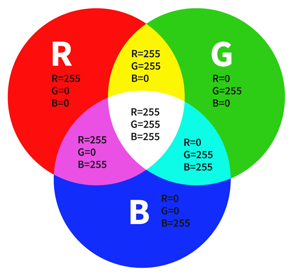
Almost all the electronic colors we see daily are rendered using the RGB color model. The vibrant, dynamic images on smartphone screens, computer monitors, televisions, and billboards are created by combining three primary colors of light: red (R), green (G), and blue (B).
As an additive color model, RGB follows a highly intuitive principle: when the intensity of all three colors is set to 0, the result is black; when all intensities reach their maximum, the combination yields pure white. By varying the brightness ratios, millions of highly saturated, high-luminance colors can be generated, resulting in an extremely wide color gamut. That’s why gradients, neon hues, and bright color schemes on electronic screens look so vivid and eye-catching.
RGB is the standard for digital displays, including web design, digital posters, online graphics, and digital artwork. Since RGB colors are created by emitted light, they almost always appear brighter and more saturated compared with printed colors.
CMYK: The Standard for Print Media
However, RGB colors on a screen cannot be directly applied to physical printing. For custom printed products—such as jigsaw puzzles, puzzle packaging, board game components, children’s books, cards, stationery, and custom packaging—production files should be prepared in CMYK mode to ensure predictable, professional results.
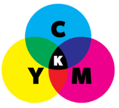
CMYK stands for Cyan, Magenta, Yellow, and Key (Black). Unlike RGB, CMYK is a subtractive color model. The base material (paper or wood) is typically white, and color is produced by layering ink. The ink absorbs certain wavelengths of light and reflects the remaining colors; the more ink applied, the darker the color appears.
In theory, combining cyan, magenta, and yellow should produce black. In practice, real inks cannot achieve perfect light absorption, and the result is usually a muddy dark brown. That’s why black ink is added as the “Key” plate—to improve contrast, shadow detail, and overall color stability.
Due to the physical limitations of paper, cardboard, and ink, the CMYK gamut is much smaller than RGB. It cannot perfectly reproduce the highly saturated neon colors or bright fluorescent tones seen on screens. Even so, CMYK remains the universal standard in the global puzzle and game printing industry because it delivers consistent, uniform physical colors.
Why Do Colors Look Different on Screen vs. Print?
One common headache for brands and designers is this: the colors on the screen look different from the final printed product. The core reason is that RGB and CMYK rely on completely different color reproduction principles.
RGB creates colors through emitted light, so screens can show a wider color range with higher brightness and stronger saturation. CMYK creates colors through ink absorption and light reflection on physical materials. Since printing relies on ink and substrate properties, its color range is naturally more limited.
This means some vivid screen colors—such as fluorescent pink, electric blue, neon green, and highly saturated orange—simply have no direct match in CMYK. After conversion, these colors may appear duller, darker, or shift slightly in tone.
For brands developing custom printed products, understanding this gap is essential. A design file that looks perfect on a monitor doesn’t always translate into the same result after mass production. Proper color conversion, proof checking, and aligning color expectations before production can significantly reduce unexpected color differences.
How Does Color Accuracy Affect Paper Product Quality?
For custom jigsaw puzzles, board games, children’s books, cards, stationery, and packaging, even small color variations can affect the final visual quality and the original design intent.
This impact is especially noticeable when the printed image is the main visual element. In jigsaw puzzle production, for instance, the complete artwork is divided into dozens, hundreds, or even thousands of pieces. Any noticeable color inconsistency between different areas can interrupt the continuity of the assembled image and affect the overall experience.
Maintaining color consistency throughout production becomes even more challenging when designs feature large solid color areas, smooth gradients, detailed illustrations, or strict brand color requirements. A slight color shift may not be obvious on a full printed sheet, but it can become noticeable once the product is cut, assembled, or compared side by side. In puzzles, this can show up as visible differences between adjacent pieces. In other paper products, it may affect image consistency between pages, cards, packaging panels, or different production batches.
Achieving stable color results requires more than just converting RGB to CMYK. It means managing printing conditions, paper characteristics, ink absorption, coating effects, and post-printing processes.
What Are the Common Color Challenges in Commercial Printing?
One typical challenge occurs when a design contains colors that look accurate on screen but fall outside the printable CMYK range.
This issue often appears in designs with gradients, pastel tones, highly saturated colors, and complex color transitions. For example, a gradient that transitions from deep red to light pink and finally to white may look soft, bright, and translucent in RGB. After converting to CMYK, the light pink area might shift toward a warmer orange-red tone, and the smooth gradient effect may become uneven.
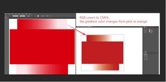
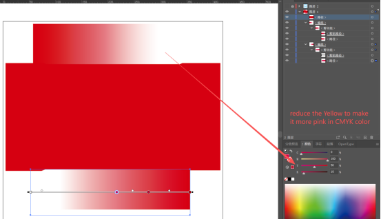
This happens because some RGB colors fall outside the CMYK gamut and have no direct ink equivalent. During conversion, the software must simulate these colors using available CMYK ink combinations. Since CMYK covers a smaller range, the converted result often shows changes in brightness, saturation, or hue.
For paper products such as jigsaw puzzles, packaging, books, cards, and stationery, these color variations can directly affect the final appearance and consistency of the finished products.
How Can Color Differences Be Reduced Before Mass Production?
Reducing color differences takes more than simply converting a design file from RGB to CMYK. A complete color management process should involve artwork preparation, color adjustment, proofing, and production control.
Here are key steps that help improve color consistency:
Convert and review artwork in CMYK mode
Design files should be converted from RGB to CMYK before printing. This helps catch potential color shifts early. Colors that exceed the CMYK gamut—such as fluorescent tones or ultra-saturated hues—may need extra adjustment to achieve a closer printed result.Perform manual color adjustments when necessary
Automatic conversion gives a general match, but it doesn’t always preserve the original visual feel. For challenging colors like light pinks, soft gradients, and specific brand colors, manually adjusting CMYK values can help balance brightness, saturation, and tone.Confirm colors through proofing
Digital previews and physical proofs let you review how colors actually appear on the printing material. This step is especially important for products with strict color requirements, such as branded custom packaging, premium puzzles, and collectible paper products.Consider materials and finishing
The final printed color is also affected by paper type, board thickness, surface coating, ink absorption, lamination, and other finishing processes. The same CMYK values may produce slightly different visual results on different materials.
Early collaboration with your printing partner also helps. Sharing artwork files in advance allows the production team to flag potential color issues and recommend adjustments before proofing begins—saving time and reducing the risk of unexpected results in the final print run.
Choosing the Right Manufacturing Partner for Printed Products
With years of experience in paper product manufacturing, Ningbo Uli supports brands with professional color management from artwork preparation to final production. Our capabilities cover CMYK printing, spot colors, color calibration, proof checking, and quality control throughout the entire process.
Whether you need custom jigsaw puzzles, board game components, children’s books, cards, stationery, or custom packaging, we focus on maintaining color consistency, accurate artwork reproduction, and stable production quality—helping your brand achieve reliable, professional results.
Contact us to discuss your custom paper product requirements.
FAQ
Can you review my artwork before production?
Yes. Reviewing design files before production is a standard part of our process. We check color mode, resolution, file format, and potential printing issues to help reduce unexpected results during manufacturing.
Do you provide samples before mass production?
Yes. Providing samples is our standard practice for confirming the final look and feel of the product before proceeding with the full run.
Do different paper materials affect the final printed colors?
Yes. Paper type, board thickness, surface coating, and ink absorption all influence the final appearance of printed colors.
Do you support Pantone colors for custom printing?
Absolutely. Pantone color printing is a common requirement. For example, many clients choose Pantone colors for the back of puzzle pieces or when large areas of solid color need precise matching. Let us know your specific needs.
What types of paper products do you manufacture?
We manufacture a wide range of custom paper products, including jigsaw puzzles, board games, cards, children’s books, stationery, and packaging.
Do you help modify customer artwork before production?
We recommend that clients provide final artwork in CMYK mode. Before mass production, we prepare a confirmation file so you can review the final appearance. As a manufacturer, we focus on accurate production, printing quality, and color consistency, while the creative design remains fully under your team’s control.